Addon Interface
Accessing Addon Interface
The main add-on panel can be found in the Blender sidebar inside the 3D Viewport (by default opened by pressing N with the mouse cursor inside the 3D Viewport area).
The sidebar interface consists of:
Data Type Selection Interface
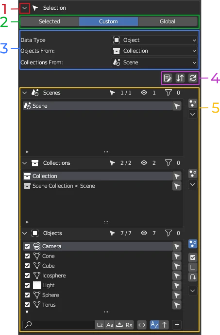
Data Type Selection Interface consists of:
- Expand and Collapse panel button
- Data Type Scope Mode
- Data Type Selection
- Lists Controls Bar
- Data Type Selection Lists
Expand and Collapse Panel button
PACKED Data Manager processes data in real-time. If your Blend file has a lot of data, under some Scope mode and Data Type configurations, the add-on may have to process a lot of data, which may result in Blender viewport becoming sluggish. Collapsing the panel, or hiding the sidebar by pressing N , will disable data processing and make PACKED Data Manager inactive. This way, the addon is active only when it is visible and when you are ready to interact with it.

Data Type Scope Mode
Data Type Scope Mode determines how Data Type Selection Lists are populated with Data Type items.
Data Type Scope Mode can be set to one of three modes:
Selected
In Selected mode, the Data Type Item List will show items of selected Data Type which can be sourced from the 3D Viewport selection of Objects. For example, if Data Type is set to Custom Property, the Custom Property Data Type list will show only those properties which belong to selected objects. If Data Type is set to Material, the Data Type list will show only those Material items which are assigned to the Objects currently selected in the 3D Viewport.
Selected mode is not available for some Data Types, e.g., World, Scene.
Custom
In Custom mode, you can specify the parent Data Type from which PACKED Data Manager should source your desired Data Type data. For example, Custom Properties can be found on most Data Types that are Data-Blocks. In Custom Mode, you can select which Data Type you wish to source the Custom Properties from.
Custom mode is not available for data types which do not have any parent Data Types, e.g, Scene.

Global
In Global mode, the selected Data Type data will be sourced from the entire Blend file.
Data Type Selection
Specify which Data Type you wish to manipulate. The available selection options depend on two factors:
- Data Type Scope mode
- Object interaction mode (object mode, edit mode, pose mode, etc.). E.g.: Bones can only be edited in armature edit mode.
Custom Data Type Scope Mode:
- If the selected Data Type can be sourced from more than one other Data Type (has more than one parent), there may be one or more additional Data Type selections with the word From: following the Data Type label.
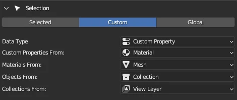
For every defined Data Type configuration, a chain of Data Type lists will be created to display their items. For the configuration depicted in the image above, these lists will be the following, starting from the top:
- Scene
- View Layer
- Collection
- Object
- Mesh
- Material
- Custom Property
The Scene list will show all available scenes in the Blend file. The View Layer list will show all view layers it could find from the scene items in the list, and so on.
Selected Data Type Scope Mode:
- If the selected Data Type can be sourced from more than one other Data Type (has more than one parent), there will be a multi-select toggle to specify the parent Data Types you wish to source the selected Data Type data from.

The parent selection can be in one of three states:
- All toggled on — Data Type items will be sourced from all parents that are toggled on.
- Some toggled on — Data Type items will be sourced from only those parents that are toggled on.
- All toggled off — same behavior as "All toggled on".
Global Data Type Scope Mode:
- If the selected Data Type can be sourced from more than one other Data Type (has more than one parent), there will be a multi-select toggle to specify the parent Data Types you wish to source the selected Data Type data from.

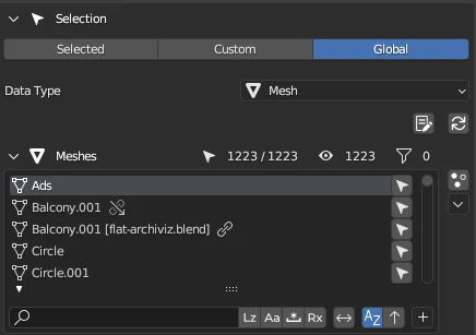
The parent selection can be in one of three states:
- All toggled on — data type items will be sourced from all parents that are toggled on.
- Some toggled on — data type items will be sourced from parents that are toggled on.
- All toggled off — data type items will be sourced from:
- all parents that are toggled on.
- orphan data pool — data type items which are not referenced by any of the parent data types (have zero users).
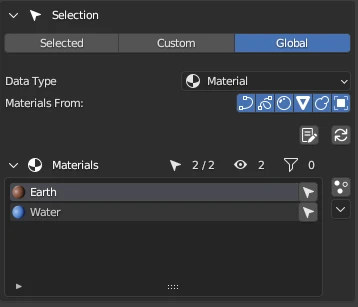
If a Data Type has more than one parent and any parent is toggled on, then the list will show only those items which are being "used" by that type parent items.
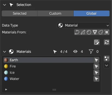
E.g.: We have 4 materials (Earth, Fire, Ice, and Water) and two objects in a scene. One object uses the Earth material and the other object uses the Water material. If the Object Data Type is toggled on in the parent selections, the list will show only two materials (Earth and Water). If we toggle off all parents, the list will show all four materials.
Lists Controls Bar

The Settings Bar consists of:
- Operation Report button — opens the operation report.
- Two-Way Filtering button — toggles the two-way filtering. Available in Custom Data Type Scope Mode mode only.
- Restore Default Settings button — restores the default settings of all the Data Type Selection Lists. This will also remove all added filters.
- Toggle Custom Select for all lists — toggles Custom Select mode on or off for all lists.
Data Type Selection Lists
Data Type Selection Lists section consists of one or more lists.
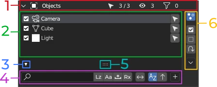
- Header
- Item List
- Show/hide filter section toggle
- Filter Section
- List resize handle — click, hold, and drag up or down to resize the list
- List Controls
Header

- Expand or Collapse toggle — expand or collapse the list.
- Data Type icon with name — indicates what Data Type items are displayed in the list.
- Number of enabled items in selection / Number of total items sourced from the parent Data Type list items.
- Number of visible items in the list
- Number of active filters (The filter icon may be colored red. This indicates that one or more of the active filters are non-functional. Expand the filter section to see which filter it is and the reason why it is non functional.)
Item List
Item list shows list items.
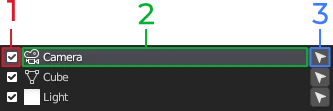
-
Enable or disable toggle — this is significant in the following ways:
- Available only in Custom Select mode.
- When toggled off, operations will not operate on this item.
- When toggled off, child Data Type lists will not source data from this item.
-
Data Type item information — shows context dependent information:
- Item icon.
- Item name.
- Library and Library Override icons — displayed next to the name when the item is part of a library linked or library overridden data.
-
Quick Select button — select in the active view layer those objects which use or are part of a selected Data Type.
List controls
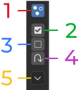
- Custom Select Mode Toggle — toggle the ability to selectively include (enable) or exclude (disable) list items from the current selection. Read more about Custom Select mode.
- Select All (Custom Select mode only) — include (enable) in selection all visible items in the list.
- Deselect All (Custom Select mode only) — exclude (disable) from selection all visible items in the list.
- Invert Selection (Custom Select mode only) — invert the status of all visible items in the list.
- Operation Menu — a drop-down menu of all available operations for the Data Type.